I will, as soon as I catch some free time, I promise I will be posting some links. For now, all I can say I am super happy with how this camera performs. Image is super sharp, compression levels are not bad at all (usual bitrate is around 15Mbps). I'd only love if the field of view is little bit wider than 140 degrees, but they do most of these little cameras with that FOV, so I guess it's OK. I'm just acting spoiled because I used my GoPro Hero3 as my dashcam for so long, and that impressive 170 degrees angle is something I love. Sure it distorts the image a bit, but there is nothing that can't be fixed in post production... plus, we're not doing any cinematography work here, so if there is a little bit of fish eye, who cares.
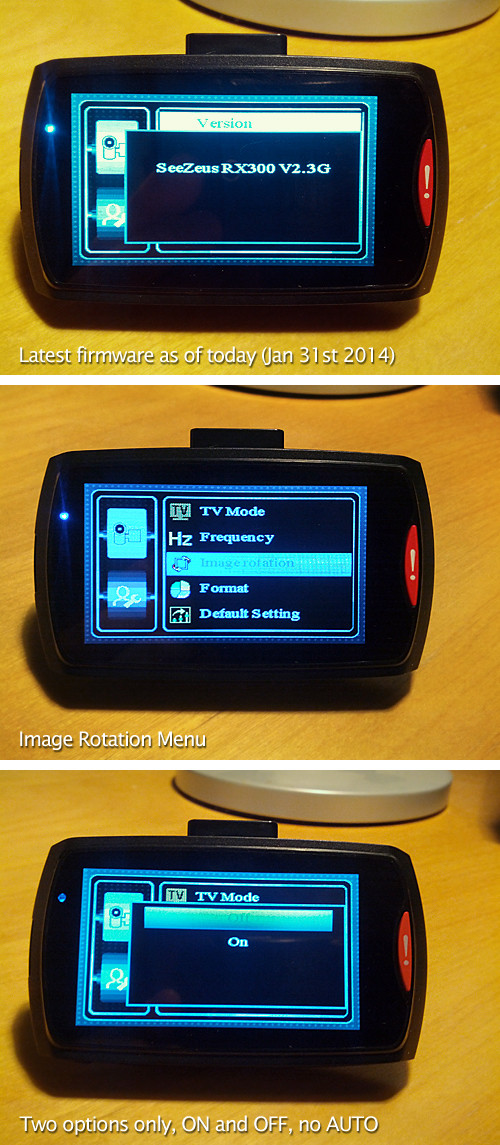
My other little problem is that Screen Rotation function. In this new firmware 2.3G, it looks like they removed AUTO option, there is only ON and OFF. I am not sure if that's something they did in purpose (no way I could think of any good reason for doing that), or they simple screwed up something while compiling new firmware.
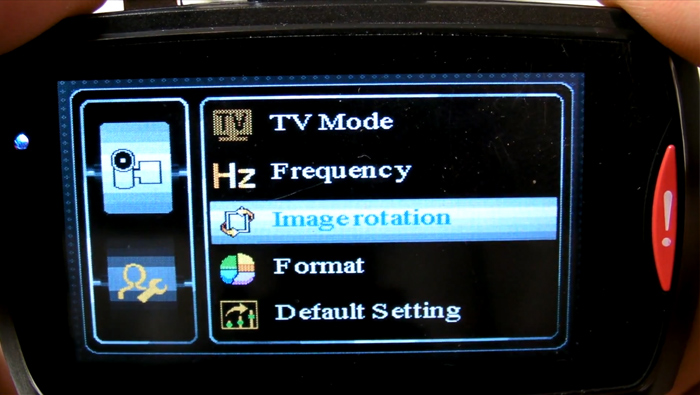
This is more of a global remark, rather than just RX300 user interface one. Couple of these cameras have almost same menus like for example GT680W - what bugs me is the thing that's not going to affect a lot of people, and it still bugs me (note: it's totally not a functional issue, but cosmetic one), is these ugly looking totally non-intuitive menus with the ugliest font ever. It's like the kitchiest of all the kitch shows out there. Icons are everywhere, no color consistency, when you're inside the menus you simply have no indication where you are. There are two settings pages for the Video shooting and two pages for the Photo shooting. It's very difficult to navigate and tell where you are at some certain points. Some color highlights or something just to tell you, you're inside that particular menu, would be very welcome.
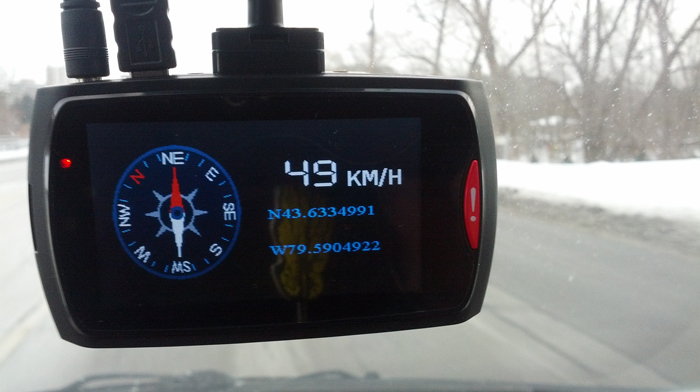
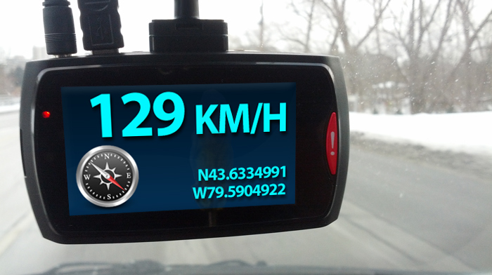
I love that GPS screensaver, so if I set it to 1 minute, after one minute instead of LCD showing what's being recorded outside, it kicks into the GPS screensaver mode showing you speed at which you're driving, compass and Latitude and Longitude information. It's great, although I'd change that too. I'd make MPH or KMPH a lot bigger. That's the most important information inside that screensaver and that's what I love to see, especially in this digital format. Current one is OK, but it is beyond me why they did that compass so large. Who is ever looking at that? I have couple of mock-ups here, couple of possible designs for new UI... if someone from SeeZeus would be interested in these. My long time hobby (over 22 years now) and my profession is very closely related to graphic design, I've designed more than enough UIs (User Interfaces) for some quite well known programs and applications, one of them being avast! antivirus).
Here is those two screens that bugs me the most... GPS screensaver one:
The current one
Possible new look
Current UI look (not bad, but could be improved)
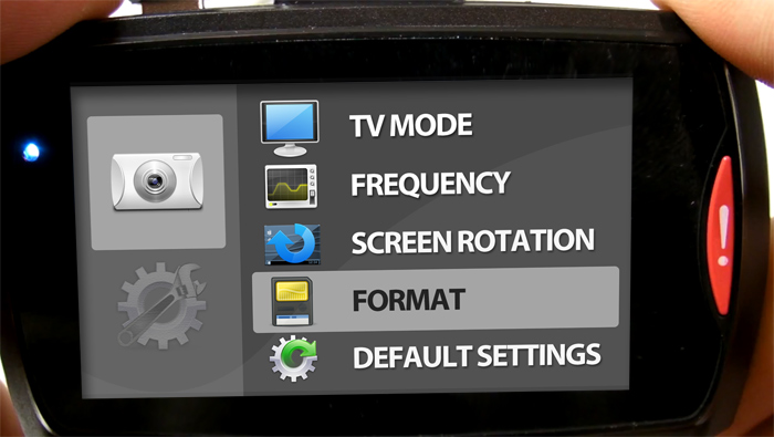
Possible clean new look with icons that actually make sense. Removed that not-welcome bling-bling, set of light bulbs along the edge of the screen. Also, sub-menus like Video Settings 1 and Video Settings 2 are clearly divided, and when you're inside the menu 1, it's highlighted so you know you're changing settings for that particular one. Of course, these icons in my example can be even more simplified, they could even be in just one color and still look good if they're done the way so they make some sense.
I know we're not spending a lot of time in these setting windows, but it would be nice if it could look more attractive, and be little more intuitive. Plus, it would help the company to look more professional and not like some kind of UI that gives impression of unfinished product. These little cameras are very powerful little tools, why not giving them a little facelift if possible?
Of course, there will always be people who'd hate to see any change, and that's OK. Everybody is entitled to their own opinion, free land, freedom of speech
")
I'd just thought I'd bring this up. Please don't hate me for that
Have a wonderful rest of the day everybody!

")
 ( sorry 4 my maybe not nice expression, but thats the reality on stupid customs / vat / import and other non-sense duties ).