That graph could have been drawn by Trump!
It hides the orange and grey ones on this graph:
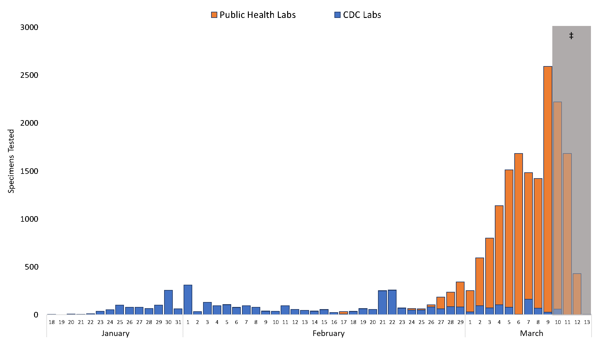
Nothing in this chart is being "hidden"!
As you did yesterday when you
disingenuously tried to equate a sudden spike in reported US COVID-19 cases where the response to the pandemic is just ramping up against a dramatic reduction in China where infection rates have been dropping by 100's per day as a result of draconian government social intervention, you again are attempting to mislead with this chart. Of course, to date the US has slightly over 1100 cases recorded against almost 81,000 in China.
The "US Public Health Labs"noted in your chart is a subsidiary of the CDC comprised of labs from many sectors which together make up the backbone of the
Laboratory Response Network.
The LRN is an association of labs from all over the country and beyond:
- Federal—These are labs at CDC, the U.S. Department of Agriculture (USDA), the Food and Drug Administration (FDA), and other facilities run by federal agencies.
- State and local public health—These labs are run by state and local departments of health. In addition to being able to test for biothreat agents, a few LRN public health labs are able to measure human exposure to toxic chemicals through tests on clinical specimens.
- Military—Department of Defense laboratories are operated both within the United States and abroad.
- Food testing—The LRN includes FDA and USDA labs, and others that are responsible for ensuring the safety of the food supply.
- Environmental—These are labs that are capable of testing water and other environmental samples.
- Veterinary—Some LRN labs, such as those run by USDA, are responsible for animal testing. Some diseases can be shared by humans and animals, and animals often provide the first sign of disease outbreak.
- International—The LRN has several international partners who provide various levels of testing capabilities.
The chart you posted shows collection dates of specimen tests. The orange bars are interim data compared with previously logged, confirmed and correlated CDC data. Nothing in this chart is being "hidden". The US is a huge diverse country with many interrelated but independent entities, such that information will become public, even if it takes longer than it should. The orange bars simply show that specimen testing is ramping up rapidly and dramatically, as it should.
To illustrate what the chart is showing, the US state I live in currently has one known case of COVID-19. It was reported today that the case was confirmed via testing at a local hospital where the patient is in isolation but the "official" CDC results for the same specimen have not come back yet. So, the results from local testing in Vermont would be reflected in the orange bars before it is seen in the blue bars.
That said, the CDC appears to be under pressure from the Trump administration to minimize the data shown on their web site and elsewhere. Certain data, such as the current number of USA deaths has been removed. This is unprecedented and is already a subject of congressional scrutiny.
The fact is that this is a fast moving situation that is changing by the hour all across the globe. Spikes in all statistics will become common, Nigel, including in the UK which is experiencing it's own spike in reported COVID-19 cases as we speak.